If you’re a business owner about to launch a new site, or you already have one live and want more customers from it, you need to know how to evaluate a website design before you spend another rupiah on ads pointing to it. Most owners judge a design on gut feeling alone, then wonder months later why the traffic isn’t turning into sales.
This guide gives you a practical, 5 step framework for reviewing website design at any stage, whether your mockups just landed in your inbox or your site has been live for years. The goal isn’t to make you a designer. It’s to help you spot what actually stops visitors from becoming customers.
Step 1: Understand What You’re Actually Evaluating
Evaluating a website design means measuring it against defined standards, including user experience, user interface consistency, credibility signals, and conversion potential, rather than judging it on personal preference alone. A proper evaluation asks whether the design serves the visitor’s goals and the business’s goals at the same time.
This distinction matters most before launch. A design can look impressive in a presentation deck and still fail to bring in customers once it goes live, so catching the gap early saves both money and time.
Step 2: Check the 5 Core Design Criteria
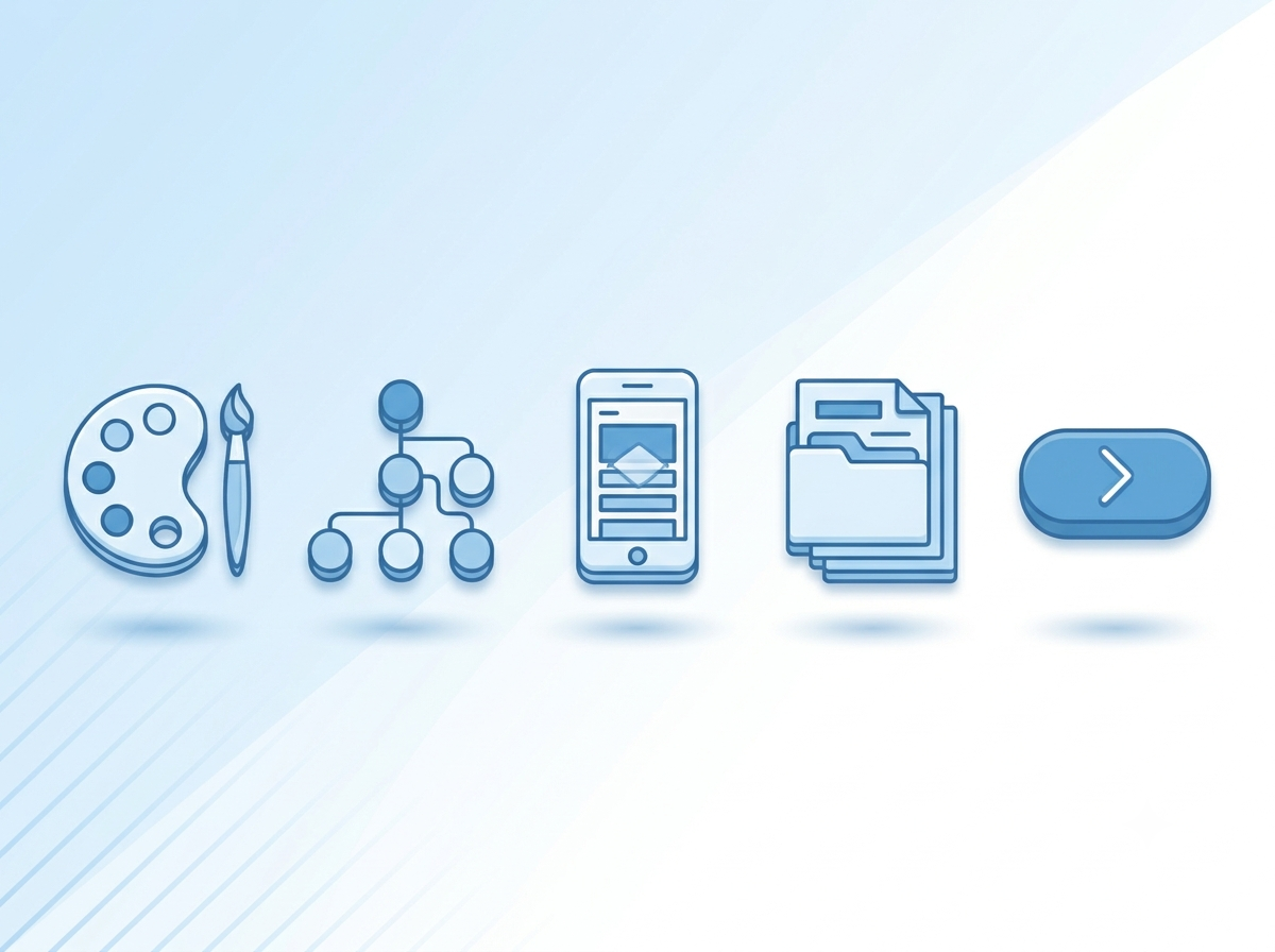
Every solid design review comes down to five buckets. Go through each one deliberately, whether you’re reviewing a pre launch mockup or auditing a site that’s already live.
Visual Identity & Branding
Check whether the color palette, typography, and imagery genuinely reflect your brand, not a generic template or a competitor’s look. Consistency across pages matters more than any single “wow” element.
Usability & Navigation (User Experience and User Interface)
Can a first time visitor find what they need in three clicks or fewer? This is where user experience and user interface decisions do the real work. Menus, buttons, and internal links should feel obvious, not clever. If you have to explain how to use the site, the design has already failed its job.
Responsiveness
Test the design on an actual phone, not just a resized browser window. Text should stay readable, buttons should stay tappable, and nothing should overlap on smaller screens. Most of your future customers will meet your business on mobile first.
Content & Messaging Clarity
A visitor should understand what your business does within the first five seconds on the homepage. If the headline doesn’t answer “what is this and why should I care,” the copy needs work before the visuals do.
Conversion Readiness
Every key page needs a clear next step: a form, a WhatsApp button, a “Book a Demo.” A beautiful page with no obvious action is a dead end for both the visitor and the business trying to capture that customer.
Step 3: Verify Credibility and Trust Signals
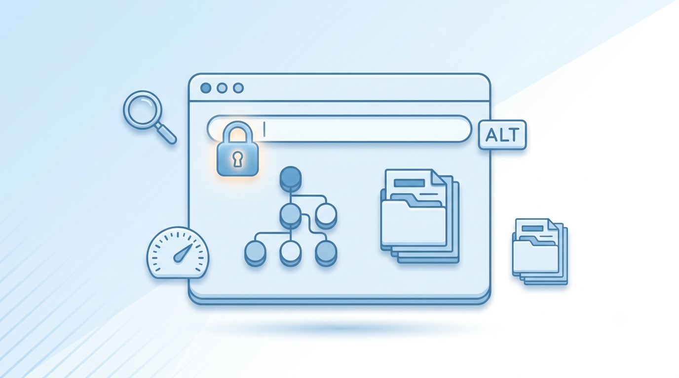
Credibility signals are different from website design quality, and it’s a mistake to treat them as the same thing. A site can look modern and still fail every trust check that matters to a real visitor, whether it’s still in staging or already live.
Look for these specific signals:
- A visible SSL certificate (the padlock in the browser bar)
- Real contact information rather than a generic contact form only
- Transparent, specific “About” content, not vague filler
- Working internal and external links, with no broken pages
- Fast load times on both desktop and mobile
- Content that reads like it was written by someone with genuine expertise in the business
Search engines and AI driven search tools increasingly weigh these same trust signals when deciding what to rank or cite, so credibility isn’t just a user experience concern anymore. It’s a business growth n too.
Does good design automatically mean a website is trustworthy? No. A polished layout can still hide broken links, no security certificate, or vague, unverifiable claims. Trust is earned through transparency and technical hygiene, not visual polish alone, so treat them as two separate checks.
Step 4: Confirm the SEO Foundations Are in Place
A stunning website design that no one can find is a wasted investment. Design and SEO aren’t separate projects, they’re the same project viewed from two angles, and business owners chasing more customers need both working together from day one.
Before launch, check that the site has a clean URL structure, descriptive page titles, and image alt text on every visual. Confirm the site loads quickly, since slow pages lose both visitors and search rankings. Make sure the design doesn’t rely on heavy client side rendering that search engines and AI crawlers struggle to read. If your site is already live, an SEO audit alongside your design review often reveals why traffic isn’t converting even though the design “looks fine.”
This is exactly where a combined SEO & SEM review pays off, since a beautifully designed page that search engines can’t properly crawl or index will never reach the customers it was built for.
Step 5: Run a Structured Review Process
Steps 1 through 4 tell you what to look for. This step tells you how to actually run the review, whether you’re approving a design before launch or auditing a site that’s already live.
Run a Gut Check First
Before analyzing anything, note your honest first reaction. Confused, impressed, indifferent? Your future customers will have the same instant reaction, so don’t dismiss it. Write it down before you start rationalizing.
Audit Page by Page
Review the homepage in isolation first, then move through each core page, About, Services, Contact, one at a time. Reviewing the whole site at once almost guarantees you’ll miss details that matter.
Consolidate Feedback Before Sending It
Assign two to four people to review, not the whole company. Group notes into “must fix,” “nice to have,” and “just a thought” before you send anything to your designer or agency. Scattered feedback slows every project down, especially before launch when timelines are tight.
Common Website Design Mistakes That Kill Credibility
Even well funded projects fall into predictable traps. Watch for these specifically, since they undo good work everywhere else on the site:
- Information overload: walls of text with no visual hierarchy to guide the eye
- Poor contrast or illegible fonts: if reading a headline strains your eyes, it’s a fail, not a style choice
- Missing or buried calls to action: visitors shouldn’t have to hunt for how to contact or buy
- Inconsistent branding: mismatched fonts, stretched logos, colors that drift page to page
- Ignoring mobile behavior entirely: most traffic today is mobile first, not desktop first
As design theorist Don Norman put it in The Design of Everyday Things:
“Design is really an act of communication, which means having a deep understanding of the person with whom the designer is communicating.”
A design riddled with the mistakes above has stopped communicating, and a visitor who can’t understand your site won’t stay long enough to trust it, let alone become a customer.
Should You Evaluate Design Yourself or Bring In a Professional?
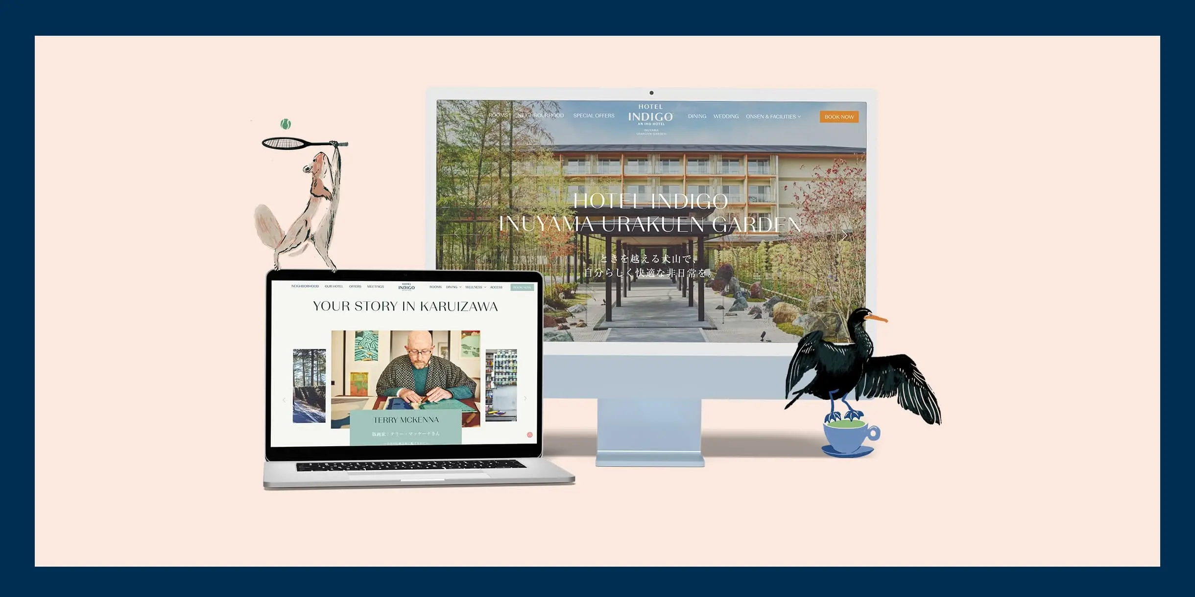
Business owners can absolutely run a first pass review using the 5 steps above. It catches most obvious issues before launch or during a routine audit. But professional UI/UX design reviews go further, testing against real user behavior data, accessibility standards, and conversion benchmarks that aren’t visible from a casual look through.
Is it worth hiring someone just to review an existing design? If the site isn’t converting despite decent traffic, yes. A professional audit usually finds friction points such as confusing navigation, weak calls to action, or a poor mobile flow that internal teams stop noticing after staring at the same design for months.
Turning Your Evaluation Into a Website That Actually Wins Customers
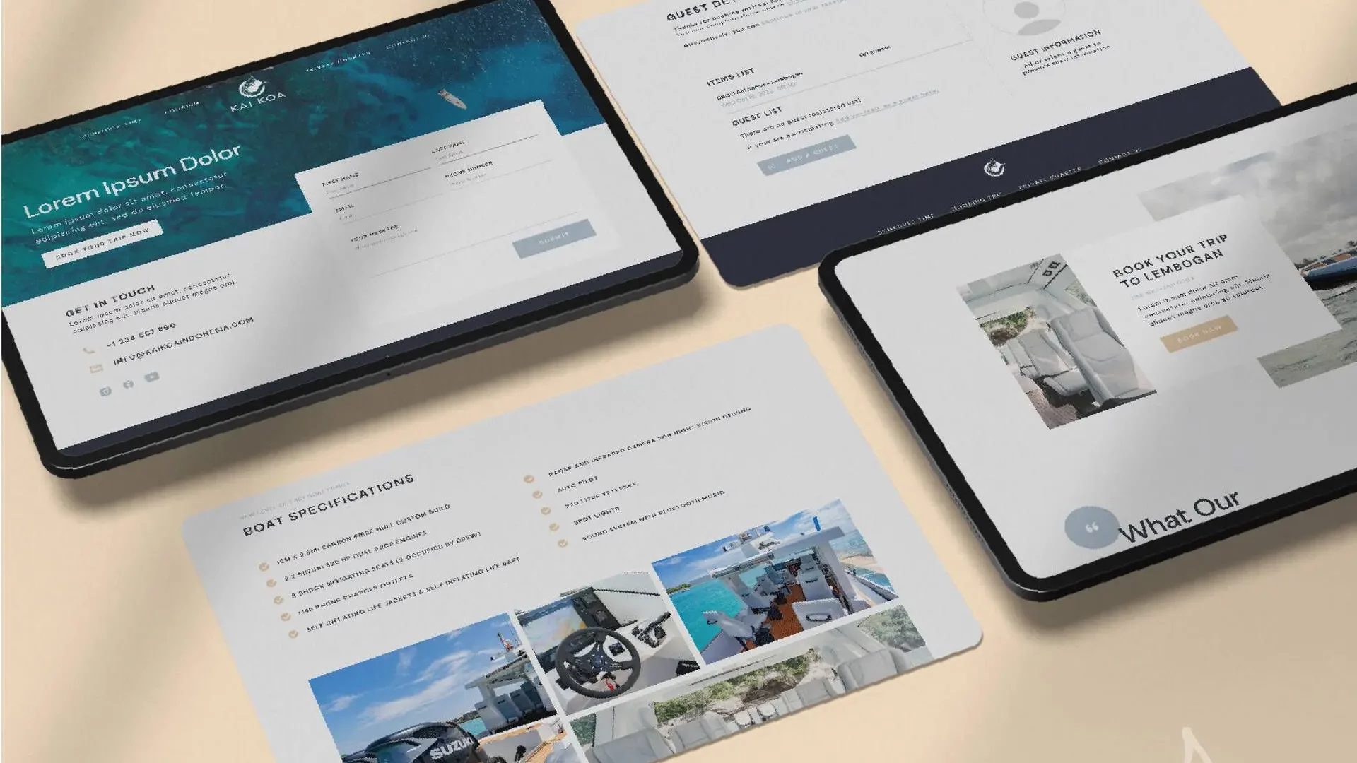
A good evaluation is only useful if it leads somewhere. Once you’ve identified what’s working and what isn’t, the next move is translating that feedback into real design and development changes, not just a list of complaints sitting in a shared doc.
That’s the gap where most in house reviews stall out. Everyone agrees something feels off, but no one has the process, or the hands on web design and development expertise, to fix it properly before launch. If your review turned up more red flags than green lights, it might be time to bring in a team that builds and evaluates websites for a living. Kesato has spent over a decade helping business owners across Bali and beyond turn design feedback into websites that actually bring in customers. Take a look at what we do and let’s talk about your project.
Frequently Asked Questions
How long should a website design evaluation take?
A first pass review of a small site typically takes one to two hours per key page. A full professional audit, including usability testing, usually runs three to five business days.
What free tools can help evaluate a website design?
Google PageSpeed Insights checks loading speed and mobile performance using Google’s Lighthouse engine, since the old standalone Mobile Friendly Test was retired by Google in 2023. WAVE is a free accessibility checker that scans a page for issues like missing alt text, low color contrast, and confusing navigation for users with disabilities, all of which affect real user experience. Together they cover speed, mobile readiness, and accessibility before you bring in a professional review.
Is evaluating design different for mobile apps vs websites?
The core principles overlap, but apps add criteria like gesture behavior, offline states, and app store compliance that websites don’t need to account for.
How often should a website design be re evaluated?
Most businesses benefit from a full review every 12 to 18 months, or sooner if conversion rates drop, a rebrand happens, or mobile traffic patterns shift significantly.concer