
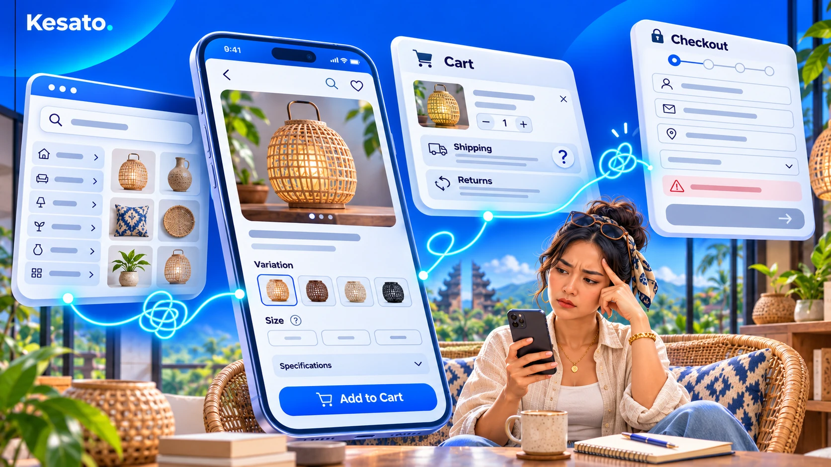
Your online store may look professional, offer great products, and attract potential customers. But what happens when someone actually tries to buy something?
A shopper might struggle to find the right product, feel uncertain about its details, discover unexpected delivery costs, or get stuck during checkout. Each of these experiences can make completing a purchase more difficult.
These are examples of e-commerce UX mistakes worth investigating. They do not explain every sales problem, but they can create unnecessary friction for customers who are already interested in buying.
Before considering a complete redesign, here are four problems to check and the first improvements you can make.
Key Takeaways
- Good e-commerce UX helps customers find, evaluate, and buy products without unnecessary confusion.
- Navigation, product information, purchase conditions, and checkout are four important areas to examine.
- Test your store as a customer before deciding which UX improvements deserve priority.
Table of Contents
- Customers Can’t Find the Products They Want
- Product Pages Leave Important Buying Questions Unanswered
- Shipping Costs and Return Conditions Are Unclear
- Checkout Makes Completing a Purchase Too Difficult
- How to Test Your Online Store’s Buying Experience
- What Should You Fix Before Redesigning Your Store?
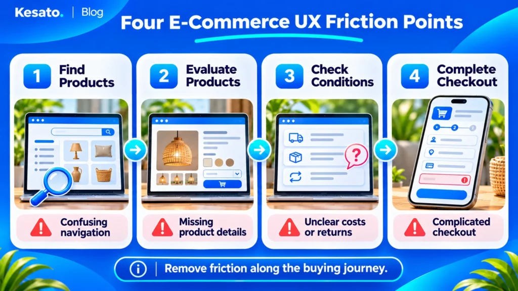
1. Customers Can’t Find the Products They Want
Imagine a customer visiting your online store to buy a specific product. They open the navigation menu, browse several categories, and try the search function. Yet they still cannot find what they need.
Unclear category names, poorly organized products, and unhelpful filters can turn a simple shopping task into a frustrating experience.
Baymard Institute’s 2026 research on e-commerce navigation highlights substantial usability problems with homepage and category navigation across leading online stores.
What to check: Ask someone unfamiliar with your website to find a specific product using their smartphone. Watch whether they understand the categories, search results, and available filters without assistance.
First improvement: Use clear category labels, descriptive product names, and filters that match how customers actually search for products. Start with the areas where your test shopper becomes confused.
2. Product Pages Leave Important Buying Questions Unanswered
Finding a product is only the beginning. Before buying it, customers need enough information to understand what they are getting.
Consider an online clothing store where a product page shows an attractive photograph but offers little information about sizing, material, or available colors. Customers may hesitate because they cannot confidently choose the right item.
These details matter beyond clothing. Depending on the product, shoppers may need dimensions, specifications, compatibility information, stock availability, or clear photographs from different angles.
Baymard’s research on product page usability demonstrates how missing or difficult-to-find product information can interfere with purchasing decisions.
What to check: Open one of your important product pages as a first-time shopper. Can you identify the correct product variant, understand its essential specifications, and decide whether it meets your needs?
First improvement: Make essential product details easy to find. Present relevant images, clear variant options, and practical information before customers have to search elsewhere or contact support.
3. Shipping Costs and Return Conditions Are Unclear
A customer may like your product but hesitate when they cannot understand the total cost or the conditions of buying it.
For example, someone adds an item to their cart only to discover a substantial delivery fee near the final payment step. Another shopper may want to know whether an item can be returned but cannot find a clear policy.
This uncertainty can make the buying experience less predictable. Research from Baymard on product page UX supports making shipping and returns information accessible while shoppers evaluate products.
What to check: Follow the purchase journey from product page to cart. Look for shipping charges or estimates, expected delivery information, return conditions, and other costs customers need to understand.
First improvement: Show relevant charges and conditions as early and clearly as practical. If delivery costs depend on the customer’s location, explain how they are calculated rather than creating an impression that shipping is always free.
Transparency helps customers understand their purchase before they commit.
4. Checkout Makes Completing a Purchase Too Difficult
Even when customers have found the right product and accepted the purchase conditions, a confusing checkout can interrupt the transaction.
Common sources of friction include mandatory account creation, unnecessary form fields, unclear error messages, and buttons that are difficult to use on a mobile device.
In its 2026 checkout UX benchmark, Baymard found that 59% of the leading US and European desktop and mobile e-commerce sites evaluated had checkout experiences rated mediocre or worse.
This does not mean your checkout has the same problems. It shows why the experience deserves practical testing rather than being assumed to work because the payment system is connected.
What to check: Add a product to your cart and move through checkout using a smartphone. Review the account requirements, form fields, order summary, and error handling.
First improvement: Remove avoidable steps where possible, support guest checkout when appropriate, make required fields clear, and explain errors in language customers understand.
Every necessary step should help the shopper complete the order rather than create another obstacle.
How to Test Your Online Store’s Buying Experience
You do not need to redesign your website before checking whether shoppers can complete basic tasks. Start with a short, structured walkthrough.
Ask someone who is not familiar with your store to complete these five steps:
- Choose a product. Give the person a specific item to look for without directing them to its page.
- Find the product. Let them use the menu, categories, search, or filters.
- Review its details. Ask them to identify the correct variant and the information needed to make a decision.
- Check purchase conditions. Have them find delivery costs, timing, and return information.
- Try checkout. Let them move through cart and checkout in a safe test environment, without placing a real paid order.
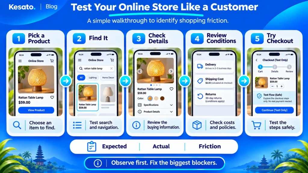
For each step, record three things: what the shopper expected, what actually happened, and what made the task difficult. Repeat the test on desktop if your customers commonly use both devices.
This is an initial usability check, not proof of why customers abandon purchases. However, it can reveal concrete issues worth investigating.
What Should You Fix Before Redesigning Your Store?
Finding several UX problems does not automatically mean your online store needs a complete redesign.
Start with issues that prevent customers from progressing, such as a broken product selection, unusable checkout field, or unclear order total. Next, address navigation and information gaps that repeatedly cause confusion.
Visual refinements can follow when they are not responsible for a more serious obstacle.
If you need a wider assessment beyond the shopping journey, our guide to evaluating a website design covers broader website review criteria.
For persistent usability problems, a structured review by an experienced team can help distinguish isolated interface issues from changes that require more extensive design work. Kesato’s UI/UX design services can be a starting point for discussing those needs.
The goal is not to make every part of your online store look different. It is to make the buying experience easier for the customers you want to serve.