
Key Takeaways
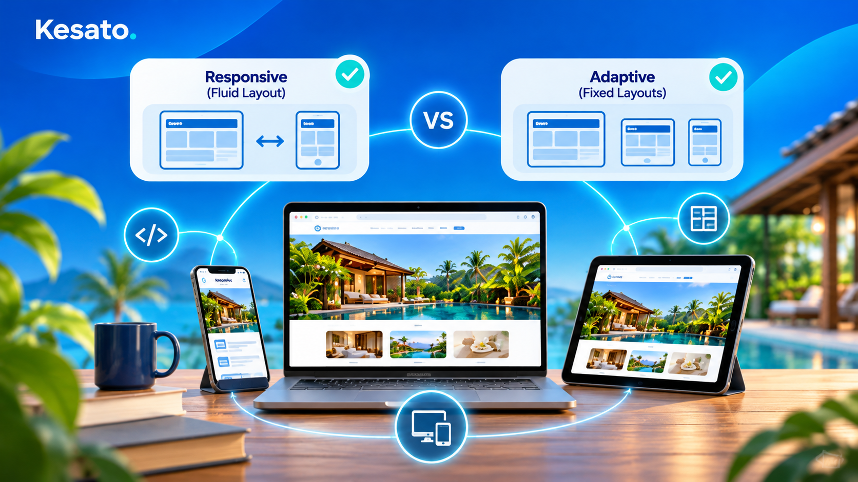
- Responsive web design uses 1 fluid layout that adjusts to any screen width. Adaptive design uses several fixed layouts built for specific screen sizes.
- Google recommends responsive web design because it uses the same HTML and URL on every device, which is easier to crawl and maintain.
- Fluid layouts, relative units, breakpoints and a mobile-first approach are the building blocks of a responsive site.
- Adaptive design can still make sense for complex legacy sites that need a very controlled layout on each device.
More than half of website visits now happen on mobile, so how a site handles different screen sizes affects both visitors and search visibility. Responsive and adaptive design are the 2 main ways to solve this, and the difference is easier to see than to describe.
The GIFs below, created by Froont, show each principle side by side.
Table of Contents
- What Is the Difference Between Responsive and Adaptive Web Design?
- How Do Responsive Layouts Actually Work?
- Which Approach Should Your Business Choose?
- Where Should You Start?
- Frequently Asked Questions
What Is the Difference Between Responsive and Adaptive Web Design?

Responsive web design uses a single flexible layout that resizes smoothly as the screen gets wider or narrower. Adaptive design detects the screen size and loads 1 of several fixed layouts, so the page jumps from one version to the next instead of changing gradually.
In practice, responsive design is built once and works on any device, including screen sizes that do not exist yet. Adaptive design gives more control over each layout, but every new screen size needs its own version.
How Do Responsive Layouts Actually Work?
Responsive web design relies on a few principles working together. Each pair below shows the responsive approach on the left and the alternative on the right.
Flow vs Static

In a flowing layout, content moves down and rearranges as the screen narrows. In a static layout, content stays fixed in place, so on a smaller screen it gets cut off or forces sideways scrolling.
Relative Units vs Static Units

Relative units such as percentages scale with the screen, so a column set to 50% always takes half the width. Static units such as pixels stay the same size on every device, which breaks the layout on screens narrower than the design.
With Breakpoints vs Without Breakpoints

Breakpoints are screen widths where the layout changes, for example moving from 4 columns to 2. Without breakpoints, elements simply shrink until text and buttons become too small to read or tap.
Max Width vs No Max Width

A max width stops content from stretching endlessly on very wide screens. Without it, lines of text become too long to read comfortably on large monitors.
Nested vs Not Nested

Nesting places related elements inside a shared container, so they move and resize together. Elements that are not nested behave independently, which can push them apart or out of alignment as the screen changes.
Desktop First vs Mobile First

Desktop-first design starts with the large layout and removes elements for smaller screens. Mobile-first design starts with the smallest screen and adds elements as space allows. Mobile first design is now the common standard, because it keeps the essential content and actions in focus.
Is responsive web design better for SEO? Generally, yes. Google recommends responsive design because each page has 1 URL and 1 set of HTML for all devices, which makes crawling, indexing and maintenance simpler.
System Fonts vs Webfonts

System fonts are already installed on the device, so they appear instantly. Webfonts give more design freedom but must be downloaded first, which adds loading time. Many sites use 1 or 2 webfonts and fall back to system fonts.
Vectors vs Images

Vector graphics such as SVG icons and logos stay sharp at any size and are usually small files. Raster images like JPG and PNG lose quality when enlarged, so photos need several sizes for different screens.
Which Approach Should Your Business Choose?
For most business websites, responsive web design is the practical choice. The table below summarises the main differences.
| Factor | Responsive Design | Adaptive Design |
|---|---|---|
| Layout | 1 fluid layout | Several fixed layouts |
| Screen sizes | Any width | Only the sizes designed for |
| Build effort | Lower | Higher |
| Maintenance | 1 version to update | Each layout updated separately |
| SEO | Recommended by Google | Workable, but more complex |
| Best for | Most new websites | Complex legacy sites needing tight control |
Adaptive design can still suit a large existing site where rebuilding everything is not realistic, or where each device needs a very specific experience. For a new build, the website development services we provide at Kesato start with a responsive, mobile-first structure.
Layout is only part of the picture. Good user interface design decides what each screen size shows first, how large buttons should be, and which content stays visible on mobile. If your site already works on all devices but still underperforms, our guide to optimizing your website design covers the next steps.
Where Should You Start?
Open your website on a phone, a tablet and a laptop, and check the pages that bring in enquiries. Look for text that is too small, buttons that are hard to tap, and content that is cut off or needs sideways scrolling. Google PageSpeed Insights and Search Console will also flag mobile usability issues.
At Kesato, our team in Bali designs and builds websites for hotels, villas, property agencies and other businesses that rely on their website for enquiries. Because design, development and SEO are handled in one team, a responsive layout is planned from the first wireframe rather than fixed after launch. If you would like Kesato to review how your site works across devices, get in touch with our team.
Frequently Asked Questions
What is responsive web design?
Responsive web design is an approach where 1 flexible layout automatically adjusts to any screen size, using fluid grids, relative units and breakpoints.
What is adaptive web design?
Adaptive web design uses several fixed layouts, each built for a specific screen width. The site detects the device and loads the closest matching layout.
Is responsive or adaptive design better for mobile?
Responsive design is usually better, because it works on any screen width. Adaptive design only works well on the sizes it was designed for.
What does mobile first design mean?
Mobile first design means designing for the smallest screen first, then adding layout and features for larger screens as space allows.